Project Overview
THE PRODUCT
Flora & Fauna is local florist shop located in the suburbs of a metropolitan area. The floral arrangement ordering mobile app is designed for easy ordering of pickup and delivery purchases for busy users.
MY ROLE
UX designer and researcher creating an app for Flora & Fauna from research to conception to delivery
RESPONSIBILITIES
Conducting interviews and user research, paper and digital wireframing, low and high-fidelity prototyping, conducting usability studies, accounting for accessibility, iterating on designs
TIMEFRAME
10 weeks
PROBLEM
Busy individuals lack the time and accessibility necessary to order floral gifts for loved ones.
SOLUTION
Design an app for Flora & Fauna that allows users to easily purchase floral arrangements.
Pain Points
I conducted interviews, created empathy maps, and personas to understand the users I’m designing for, and their needs. A primary user group identified through research was adults buying floral gifts for loved ones through apps.
Research also revealed that other factors were limiting users from having successful experiences purchasing products.
1
Time
Working adults are often busy and need a clean interface to quickly and easily browse and purchase their gifts
2
Accessibility
Platforms for ordering floral arrangements are often not equip with assistive technologies
Target User Group & Persona
-
“I love running my business and I love my partner. I want to be able to make time for both.“
Ferdinand is a career-oriented adult in a long-term relationship in need of an easy-to-browse and accessible user experience when purchasing products because his busy schedule makes him unable to fulfill the pick–up/delivery himself, and also due to his visual impairment.
Paper Wireframes
Taking the time to draft different iterations of the homepage ensured that the elements that made it to digital wireframes would be well-suited to address user pain points. For the homepage, I prioritized having the most crucial elements be easily accessible at a glance to help the users save time and energy.
Digital Wireframes pt. 1
As the initial phase continued, I made sure to base screen designs on feedback and findings from the user research.
Easy navigation was a key user need to address in the designs, in addition to equipping the app to work with assistive technologies.
Digital Wireframes pt. 2
Low-fidelity Prototype
My initial lo-fi prototype consisted of the following: home page, listings page, item page, cart, checkout. The lo-fi prototype connected the primary user flow of ordering floral arrangements, so the prototype could be used in a usability study with users.
Usability Study: Parameters
Study Type: Moderated
Location: United States, remote
Participants: 5 participants
Length: 10 - 15 minutes
Findings
1
Sequence
The checkout process ending abruptly without finishing in the prototype confused most users
2
Language
Users want options for different languages available for those not fluent in English
3
Features
Users want a calendar for easily selecting dates for pickup/delivery
Mockups pt. 1
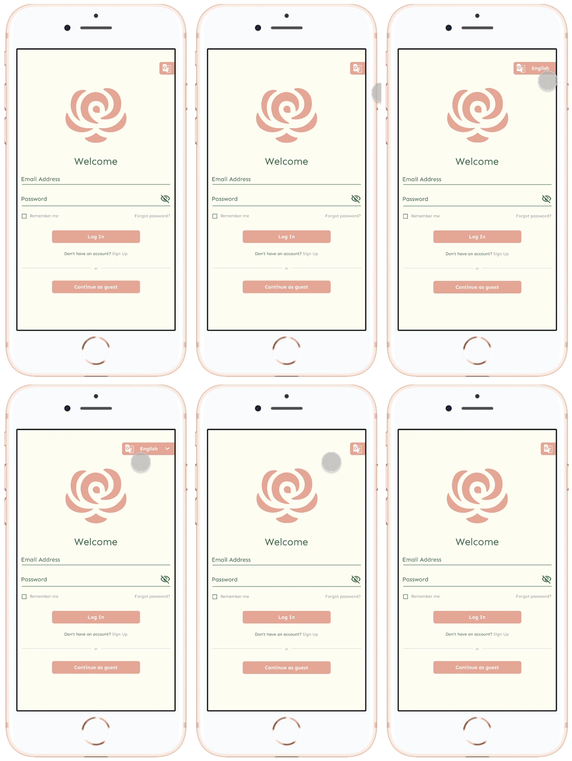
In early designs, there was no way to change languages, but after the usability study, I added the option to switch languages using an easy-to-find tab. I also built a log-in/profile creation screen to allow for speedier checkout with a saved profile, and to easily find the change language tab when users first land on the screen.
Mockups pt. 2
The second usability study revealed frustration with the ordering flow. To streamline this flow, I added in a calendar pop-up that appeared instead of users needing to type in a month and day for pickup and/or delivery options.
Key Mockups
High-fidelity Prototype
The final high-fidelity prototype presented cleaner user flows for ordering floral arrangements and checkout. It also met user needs for a pickup or delivery option, as well as having the option for different languages.
Accessibility Considerations
1
Voice
Included a “voice-to-text” icon option in the search bar for users who aren’t as able with the mobile keyboard
2
Translate
Tab for translation for different languages for non-English speakers
Next Steps
1
Conduct another round of usability studies to validate whether the pain points users experienced have been effectively addressed
2
Conduct more user research to determine any new areas of need or additional accessibility options
Reflections
Account for the unaccounted
While designing the Flora & Fauna floral app, I learned that this is really only the beginnings of a project. Usability studies and peer feedback influenced each iteration of the app’s design, and I was made really aware of taking accessibility into account as you never know who might be using your product. When designing for users, you have to consider and cast as wide a net as possible for usability. This leads to a greater chance for success and happiness for everyone involved.


